Wednesday, April 27, 2016

Culture Jammers


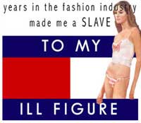
What company does the advertisement represent/subvert?
Tommy Hilfiger and Starbucks are being represented.

What kind of product(s) is being advertised?
Tommy Hilfiger is advertising clothes and the Starbucks is advertising coffee.

What imagery is used in the advertisement to subvert?
An unhealthy looking thin woman is shown for Tommy Hilfiger. Starbucks shows a crown on the mermaid's head and the words "Six Bucks Coffee".

What message is used in the advertisement?
Tommy Hilfiger: You must be incredibly thin to fit into the clothes.
Starbucks: They sell over-priced coffee.

How are the elements and principles of design used to convey a message?
Both designs are quite simple, taking the logo of the company they're jamming and adding to it to make their message.

Does the ad jam convey a clear and successful message?
I think that both of these make very clear and agreeable points. The message is very successful.

How could the ad jam be improved?
These ads could be improved maybe With a bit cleaner work (at least for the Tommy Hilfiger ad). Otherwise I don't think anything really needs to be improved.

Friday, April 8, 2016

Cinemagraph


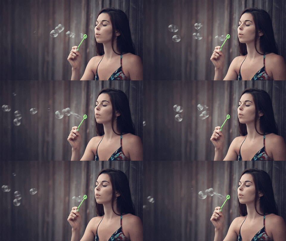
http://content.photojojo.com/wp-content/uploads/2011/06/large_cin15.gif
https://media.giphy.com/media/vYTo95h4e2j6M/giphy.gif
http://media02.hongkiat.com/cinemagraph-photoshop-tutorials/3-cinemagraph-photoshop-tutorials.gif

I chose these three cinemagraphs as examples because they are cool, yet simple (looking). They make me feel that even if I make a simple cinemagraph, it can still look good.


This is a cinemagraph I made so I had something to work on until I could get my own footage. I got the clip from Tokyo Ghoul Season 1 Episode 8. © Sui Ishida and Funimation


Danielle
“Cinemagraph”
Made in Photoshop CC 2015
April, 8th, 2016

Technical
To make my cinemagraph, I first recorded some video to use. Although nit he absolute best, I think it still works. I then opened my video in Photoshop CC. In the timeline, I cut part of the beginning of my video. I then duplicated the video layer. The copy I put underneath and at the end of the original layer. I then extended it so the whole video was there. I then adjusted the opacity of the original layer, making it 100% at the beginning of the copied layer, and 0% by the time the original layer ended. Afterwards, I made a still picture layer using Shift+Ctrl+Alt+E. On this picture layer, I created a layer mask and "hid" the the area over and around the bag and arm, allowing the video to show through. (I clicked the slash above the enter button to see what area I was "hiding"). When I finished with that, I saved it for the web. I tested it out on a blank webpage first and then posted it here.

Idea or Concept
I didn't have an exact idea about what I wanted to do with this. As days then a week or so went by, I decided I would work with whatever footage I could get. I originally thought of doing feet walking by the camera on the ground, but then thought that had no real challenge to it. It would just look like a gif instead of a cinemagraph. I then was able to get this footage and decided to work with it.

Influences
No artists influenced me for this project.

Composition
I like how with this, the bag moving immediately draws the eye. One thing I'm not as impressed with is how the arm draws attention too. It doesn't look as good as the bag. If you're like me, you'll get bored with the movement eventually and explore the background, which is how I end up looking around.

Motivation
I didn't really have any inspiration other than completing the assignment. As stated above, I like how the bag loops better than the arm does. I wouldn't have included the arm but the bag string floated off behind her arm if I didn't include it. I found it very easy and was able to make this quickly. With additional time I would try finding better footage  and seeing if that would take me longer.
Tuesday, March 22, 2016

Custom Brush


Danielle
“Yuu x Mika Brush Scene”
Made in Photoshop CC
March 22, 2016

Technical
To make this, I took the picture of chibi Yuu and Mika (Seraph of the End) from here: http://41.media.tumblr.com/ddf1773070974937aa513ffda474742c/tumblr_nmypxvCWde1ranzwvo1_1280.png.
I then selected it and went to Edit > Define Brush Preset. I then saved it as YuuxMika. Next I opened the brush menu and clicked on brush preset manager. I clicked on the brush I had created and selected save. That's how I created the brush. I then played around with different brushes to create this scene.

Idea or Concept
I didn't really have any ideas at first, I just wanted to play around. I then found a brush that looked like grass and made some grass. I then painted the background blue. I then placed my Yuu x Mika brush so it looks like they're standing at the top of a hill or farther away in a field. Then I found a leaf brush and made it look like fall. It's not prefect but it was fun.

Influences
No artist influenced me.

Composition
I feel that the colourful scene keeps your eyes moving and the black and white brush stands out even more.

Motivation
I created this for fun after learning how to make a custom brush. With more time I would paint any remaining white spots blue so the whole sky is blue.

Wednesday, March 9, 2016

Facebook Profile Cover


Danielle
“Facebook Profile Cover”
Made in ­­­Photoshop CC
Mar 8, 2016

Technical
For this project, I used all my own original pictures and preset brushes in Photoshop. I took the mandalas I had created during the mandala project and made it look like they were hanging from strings. I did that by using the Single Column Marquee Tool and selecting just that, a single column. I then painted it white with the brush tool. For the background, I used a preset leaf brush and left many different coloured leaves everywhere. I then experimented with the smudge tool and created the multi-coloured background I have. I also added shadows to the mandalas and a small stroke around them so they stand out a bit more.

Idea or Concept
At first I had no idea what to do since I had to use only my original pictures, nothing copyrighted from the internet. I then remembered how I had created multiple mandalas and came up with this.

Influences
I did not have any influences for this piece.

Composition
I feel that the background merges together nicely and doesn't attract too much attention away from the mandalas. For the mandalas, I feel like I placed light one's together with a dark one in the middle, and vice versa. This helps keep the eye moving around the piece.

Motivation
Beyond fulfilling the requirements for this assignment, I wanted to make something cool that I thought of, not something I went searching on the internet for. Of course I'm sure I've seen stuff like this, but this time, I thought of doing it. I wanted to see if my idea of the mandalas hanging from above would look good, and I think it does. I'm surprised how well it turned out as I honestly did not expect it to work. With additional time I would have experimented with more things to see if I could make it even more creative and interesting or see if I could create something else.

Tuesday, March 1, 2016

Low Key Crystal


Danielle
“Low Key Crystal”
Made in ­­­Photoshop CC
March 1st, 2016
  
Technical
To practice I took a picture of a pug and followed the steps I was given. After practicing, I took a photo of my own dog Crystal, a Jug (Jack Russel and a Pug mix). I then used a channel mixer to make it monochrome then made a levels layer and played around with the darks and lights I ended up creating the above picture.
Idea or Concept
I really only wanted to complete the tutorial. I tried to make the picture as dark as I could without losing the light in Crystal's eyes.
Influences
No artist influenced me during this piece.
Composition
With this piece, I feel that the eyes explore the lighter parts first before moving around the dark/black. I like how as dark as it is, there is enough lighter parts that you can see an outline and make out that it is a dog.
Motivation
Beyond fulfilling the assignment, I wanted to see if I could create a dark/low key picture like this without it bugging me (I like dark colours/black but not so much it covers the picture). The above picture is as dark as I could go without having second thoughts. I really like how the lights around Crystal's head create an outline and make her stand out a bit more. With additional time I would have played around with the levels a bit more.

Monday, February 29, 2016

Double Exposure

Danielle
"Double Exposure"
Made in Photoshop CC
February 29th, 2016
&
June 9th, 2016

Technical
TOP:
To start off, I took pictures from the internet, found here: 
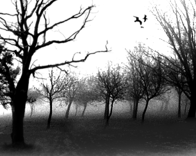
I then opened the picture of the person (in my case Evan Peters) and used a layer mask to "hide" everything but him. I then opened the background pictures and placed them where I thought they would look good. I then created layer masks on all the pictures. I Ctrl-clicked the person layer and in the layer masks of the background pictures, "hid" everything outside the selected area. After I was happy with that, I went through the layer blends until I liked how the background pictures looked (but this is not necessary). Next I made a duplicate of the person layer and placed it on top. I then went through the layers blends until I got what I liked, which is the result up top.

BOTTOM:
I took my own pictures and opened them in photoshop. I then played around with the pictures using my memories of my double exposure from February, and got this.
Idea or Concept
TOP:
The first idea that popped into my head was taking a picture of Evan Peters and using dark forest backgrounds to represent Peters' character Tate Langdon from American Horror Story, who is dark and mysterious.

BOTTOM:
I took a picture of my pug Buster and a picture from the Scenic Caves because Buster is quite adventurous. He loves to go on walks in nature and seems to loves trees.
Influences
No artist influenced me on this piece.
Composition
TOP:
I like how my eyes move around the piece. They go from the darker part at the bottom left to the lighter parts, up to the black birds flying above in the white. I also feel that my eyes follow the trees and branches up to the top, which again leads to the birds flying up above.

BOTTOM:
I feel that Buster's lighter face is the center of attention but allows the eye to move on tot he darker green trees in the background.
Motivation
Other than completing this for class, I thought it would be cool what I could create using this technique. I wanted to see if I really could make something like this that appears dark, and mysterious and also another cute picture of my pug. I like how the pieces look overall. With additional time, I would have experimented further and see what else I could create and add to this piece.

Friday, February 26, 2016

Koalaguin


Danielle
"Koalaguin"
Made in Photoshop CC
Feb 26, 2016

Technical
For this work, I took the head of a koala and placed it on top of the penguin's heads. I used layer masks so that I wasn't permanently erasing the pictures and then I posed them on top of the penguin's heads, rotating and flipping to cover the heads.

Idea or Concept
Originally, I was going to use a capybara and I believe a koala for this project. I created a picture I didn't initially like. It ended up getting deleted after issues with the computer. I then took the penguin and koala pictures from the sample picture folder and put them together, resulting in this.

Influences
I did not have any influences for this piece.

Composition
This piece immediately draws the viewers eyes to the koala heads as they are grey in a picture full of blue (and a bit of yellow).

Motivation
Other than completing this as an assignment, I thought it would be cool to try to create a (somewhat realistic) picture where one animal's head is on a different animals body. I think that although the koala heads don't necessarily blend in the best, I think they fit better than I had thought they would. I was surprised how they fit together better than I had expected. With additional time I would figure out a way to blend the Koala heads with the penguin necks better to make it look even a bit more realistic.