This is my first blog which has been made to publish my Media Arts work. So in short...this is for my Media Arts class. My Media Arts blog :P
Monday, March 27, 2017
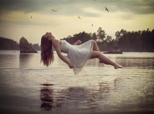
Levitation
1. Use emojis to describe how you felt about the process of making your art, and how it turned out in the end: 😅😮😀😁😊👍
2. How did you fail when you worked on this assignment? (5 sentences minimum)
I failed because of my imagination and ability to make the things in my head reality. I imagined something much more dramatic. I also seem to be unable to properly see colour. Multiple times I thought something looked good, but was told to make it darker, or less red, etc. And I don't really know what the shadows would actually look like so they are most likely way off 😅
3. Please explain why your failures were actually great, and what you learned from them (6 sentences minimum)
My failures are actually great because I learned more about colour correcting and how to make different things look (at least a bit) realistic and like they belong together. Even though I couldn't create the exact image I had in my head, I think it still turned out really good. I learned that I must be careful choosing my pictures, as it wasn't until I started working that I made notice of the light source in the back. It looks kind of awkward, but at the same time I think it looks fine. I feel I also made the whole picture a little dark. I wanted a mysterious, dark look, but I think I went a tiny bit overboard. At the same time though, I didn't like it being any lighter.
Thursday, March 2, 2017
Levitation Photography Research
http://photodoto.com/wp-content/uploads/2013/12/16-levitation-photography-levitation-tutorial.jpg
https://s-media-cache-ak0.pinimg.com/736x/01/2c/90/012c90c7bd6ec0e4b033a6c08157cfd7.jpg
https://s-media-cache-ak0.pinimg.com/originals/76/31/3d/76313d08ebc23a1cccec79752d6aee19.jpg
What I love about these pictures is how cool they look. Floating above water like they're going to fall in. Surrounded by paper planes you can fly around with. And floating in a magical forest surrounded by falling red roses(?). It looks so magical, it's hard to explain.
Who is this for? Name, Age, Likes, and Dislikes?
Danielle, age 18
Likes: Anime, manga, creepy/supernatural things like ghosts, comedy, Japan, Japanese, travelling, the city, forests, fantasy worlds, water, swimming, skating, gothic lolita-style dresses, pretty clothes, animals, writing, creating, sleep, music, warmth, cosplay
Dislikes: Injustice, rude people, the cold, pain, frustration, chaos, places creepy at night
What makes them unique? Needs, wants, dreams, fears?
Unique: Creative imagination, love to learn and try new things
Needs: To be loved, kept calm, live in a calm and quiet environment, relaxing breaks, be a kid as long as possible, money
Wants: Safety, money, anime merch, band merch, go to more concerts, a just world
Dreams: To travel to Japan, India, and Mexico first - actually leave the country, become a published author, have a beautiful family
Fears: Death, pain, world war, apocalypse, the rich taking over, swallowed by anxiety and emotions, dying without amounting to anything
Crazy 8's Brainstorming:
My favourite idea from Crazy 8's is #5: Flying through a Japanese shrine. I'm not sure what to expect with this idea, so I'll have to play around.
https://s-media-cache-ak0.pinimg.com/736x/01/2c/90/012c90c7bd6ec0e4b033a6c08157cfd7.jpg
https://s-media-cache-ak0.pinimg.com/originals/76/31/3d/76313d08ebc23a1cccec79752d6aee19.jpg
What I love about these pictures is how cool they look. Floating above water like they're going to fall in. Surrounded by paper planes you can fly around with. And floating in a magical forest surrounded by falling red roses(?). It looks so magical, it's hard to explain.
Who is this for? Name, Age, Likes, and Dislikes?
Danielle, age 18
Likes: Anime, manga, creepy/supernatural things like ghosts, comedy, Japan, Japanese, travelling, the city, forests, fantasy worlds, water, swimming, skating, gothic lolita-style dresses, pretty clothes, animals, writing, creating, sleep, music, warmth, cosplay
Dislikes: Injustice, rude people, the cold, pain, frustration, chaos, places creepy at night
What makes them unique? Needs, wants, dreams, fears?
Unique: Creative imagination, love to learn and try new things
Needs: To be loved, kept calm, live in a calm and quiet environment, relaxing breaks, be a kid as long as possible, money
Wants: Safety, money, anime merch, band merch, go to more concerts, a just world
Dreams: To travel to Japan, India, and Mexico first - actually leave the country, become a published author, have a beautiful family
Fears: Death, pain, world war, apocalypse, the rich taking over, swallowed by anxiety and emotions, dying without amounting to anything
Crazy 8's Brainstorming:
- Falling towards the city
- Floating above a pond in the forest
- Floating with black figures surrounding me
- Floating in a sitting position writing and surrounded by floating books
- Flying through a Japanese shrine
- Floating above my bed like alien levitation
- Floating and surrounded by puppies floating around
- Floating above a rock concert
My favourite idea from Crazy 8's is #5: Flying through a Japanese shrine. I'm not sure what to expect with this idea, so I'll have to play around.
Tuesday, February 28, 2017
Photography and Editing
1. What emojis best describe how you felt about the process of making your art?
😀😄😁😮😍😎😑
2. How did you fail when you worked on this assignment? (5 sentences minimum)
I definitely failed when taking the pictures. All of my pictures are pretty far away, especially the one(s) by the tree because I was on the other side of a small stream. Also, the camera didn't like to behave, or i just didn't know how to get it to listen. I would focus on my subject and slowly move away so it was off centre, but then as I took the picture, the camera would focus on the background and blur my subject. The exposure outside wasn't the best, and I also don't think I'm very good at the editing part either.
3. Please explain why your failures are actually great and what you learned from them. (6 sentences minimum)
Even though my pictures are farther away from my subject then they probably should be, I think my pictures still turned out great. My subject is still off center and there's a lot more to look around at. A few of my pictures that the camera blurred my subject but not the background look cool as well. I know one, yeah the subject is blurred but the detail of the tree bark is amazing. My favourite picture is one where the camera wasn't working properly. I took it and aimed it towards a stained glass window. I clicked the button but the shutter stayed open and created the coolest (and only) overexposure picture I've ever created!
Friday, May 20, 2016
Cyanotype
Danielle
“Cyanotype
Made in reality
“Cyanotype
Made in reality
May 20th, 2016
Technical
This was completely new to me. I thought it would be harder than it actually was. All I had to do was print off my picture in negative, and then the teacher photocopied it onto a transparent sheet (like sheets for an overhead). I then took a piece of watercolour-like paper, and rolled the special paint (stuff) onto the paper. After that, I set my translucent picture on top and made a sandwich of foam, my picture, and a glass frame on top, clamping it down to keep it secure. I then set it in a window in sunlight for eight minutes. After eight minutes had passed, I took it out from the window and removed the picture. I then washed the picture off in soapy water and hung it to dry.
Idea or Concept
I've had this cute picture of my pug Buster since July last year and couldn't wait to use it in art. This was the perfect chance. My idea didn't change at all since I was told this picture was good to use for this project.
Influences
No artists influenced me with this.
Composition
I think this picture works well because both sides of Buster are visible and the lights fade into the darks. It came out more visible than I think the original picture looks. The lights draw your eyes first then let them wander to the darker areas.
Motivation
Other than for class, I did this so I could have a cute (and cool) picture of my adorable pug Buster. For this, I pretty much just did what I had too and hoped it turned out well. I was surprised at first how we had to print the picture in negative. I was also surprised how well it turned out. With additional time I would make a few more test pictures to figure out the best time to leave it in sunlight for before doing a good/final version.
Thursday, May 19, 2016
Culture Jammer
Danielle
“Culture Jammer”
Made in Photoshop CC
Date: May 18th
Technical
It was quite easy. I found a picture I thought would work and added my re-made Forever 21 logo.
Idea or Concept
I wanted to slam Forever 21 because recently when I went in with my little sister, their clothes could most likely fit my nine year old sister (who is quite thin) perfectly. Not very good for people with low self-esteem.
Influences
No artists influenced me with this piece.
Composition
I didn't do much to the picture. The logo stands out which brings attention to the slam. Otherwise, the monochrome doesn't really allow much movement of the eye. At the same time though I think it works because the eye is brought to the logo which is the slam against Forever 21.
Motivation
As I said before, I want to slam Forever 21 because their clothes don't fit healthy 21 year olds. They fit normal 9 year olds. I feel like twelve year olds may hardly fit in their clothes (That may be an exaggeration). I didn't really explore any visual ideas. I just wanted the logo/slam to pop. Nothing during the process surprised me. With additional time I probably would've gotten a different picture and/or did some more editing on it.
Toy Hack
Danielle
“Toy Hack”
Made from used toys.
Date: May 18th
Technical
To create these, I went through the pile of used toys we were given. I found a fairy doll and an MLP. I took the wings off the fairy and then thought I could turn it into a centaur. I cut the doll and pony in half and hot-glued the fairy's upper body to the pony's. I used the fairy's dress to hide where the bodies combine, and added the wings onto its head. I also added a little button like thing as decoration on the dress. I then used the horses head and attached it to the fairy's legs. I then hot-glued a giraffe toy's behind onto it, after cutting off the giraffe's head. I then cut off the horse's hair and wrapped it around its neck. I also wrapped the body in black yarn and added "earrings" to the horse's ears.
Idea or Concept
My idea came after finding the fairy and the MLP. I thought I could turn the fairy into a centaur. After I made my centaur, I figured I could put the horse's head onto the fairy's body, like a reverse centaur. I then found a toy giraffe and added that t my reverse centaur to make it stand on its own.
Influences
No artists influenced my work.
Composition
I think I did a good job at hiding where the two toys are fused together. The bright colours on both attract and move your eyes around into the darker parts.
Motivation
I wanted to make something better than what I did last year. I believe I achieved that. This toy hack looks more realistic than last years. After seeing the toys, I decided to make a centaur like-toy. I think that the believability of my toy hack is interesting and successful. I was surprised by how quickly I was able to make my toy hacks. It took me only one class for each toy (if I remember correctly). With additional time and more toys I probably could've created something completely different, or thought of more decorations I could have added on.
Wednesday, April 27, 2016
Culture Jammers


What company does the advertisement represent/subvert?
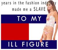
Tommy Hilfiger and Starbucks are being represented.
What kind of product(s) is being advertised?
Tommy Hilfiger is advertising clothes and the Starbucks is advertising coffee.
What imagery is used in the advertisement to subvert?
An unhealthy looking thin woman is shown for Tommy Hilfiger. Starbucks shows a crown on the mermaid's head and the words "Six Bucks Coffee".
What message is used in the advertisement?
Tommy Hilfiger: You must be incredibly thin to fit into the clothes.
Starbucks: They sell over-priced coffee.
How are the elements and principles of design used to convey a message?
Both designs are quite simple, taking the logo of the company they're jamming and adding to it to make their message.
Does the ad jam convey a clear and successful message?
I think that both of these make very clear and agreeable points. The message is very successful.
How could the ad jam be improved?
These ads could be improved maybe With a bit cleaner work (at least for the Tommy Hilfiger ad). Otherwise I don't think anything really needs to be improved.
Subscribe to:
Posts (Atom)